Simplify Interior
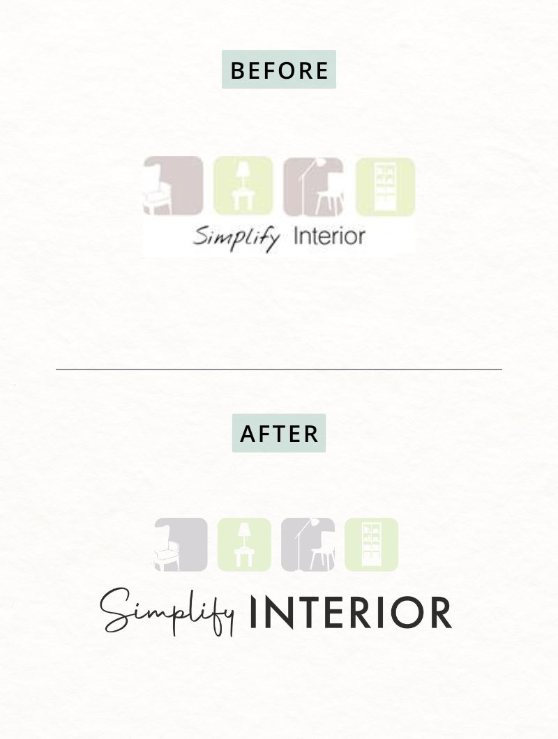
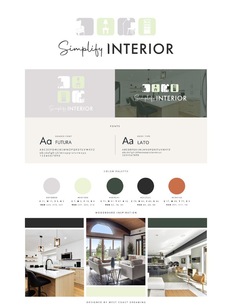
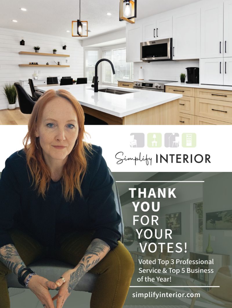
Simplify Interior had an established visual identity, but its typography didn’t reflect the sophistication of the designer’s work. I refined the brand while preserving its recognizable colours and symbolism, so the business presents a more polished and professional image without losing its identity.
The Challenge
The existing logo contained meaningful visual elements worth retaining, but its typography felt informal and disconnected from the quality of the interior design services. The goal was to elevate the brand rather than reinvent it.
What I did
- Evaluated the existing logo for opportunities to improve its professional appearance.
- Refined the typography to better reflect the quality of the business.
- Preserved the established colours and symbolism.
- Improved the overall visual balance and consistency of the identity.
At a glance
Client: Simplify Interior, interior design
Services: Logo refinement, visual identity update, Newspaper ad design
Tools: Adobe Creative Suite, Canva
The Result
A more refined, professional brand identity that better represents the designer’s work while maintaining the recognition and character of the original.